What e-commerce business doesn’t constantly ask: “How do we get more users to check out?”
It’s the simplest and most common goal of any e-commerce business. Of course, the next, not-so-simple step is implementing e-commerce conversion strategies that are actually effective and drive customers to make those purchases. One important and concrete way to increase these e-commerce conversions is by improving the usability of your store.
In this post we’ll look at usability guidelines every e-commerce store should be following and how usability fits into a complete e-commerce conversion optimization process. You’ll learn conventions for shop usability and how to employ them to make more money from your online shop.
What you’ll learn:
What is usability and why is it important for sales?
The truth about conversion optimization
How usability fits into a holistic conversion optimization process
E-commerce usability guidelines
Free bonus area: 247 point usability guideline checklist
Great Usability = More Sales
Great Usability = More Sales
So what is usability and why is it important to your business?
Usability is a quality attribute that assesses how easy an interface is to use. Therefore, if your store’s interface is hard to use your potential customers will leave without making a purchase and your business will suffer.
But what does this have to do with CRO (Conversion Rate Optimization)?
Conversion Optimization: The Truth Revealed
You all know that to increase the percentage of your visitors who checkout or buy you need to use conversion optimization. But most people misunderstand what conversion optimization is really about.
Many people think it is the same thing as A/B testing. This is not true — A/B testing is just a small part of a much bigger process for conversion optimization. Other people think it means analyzing your website analytics. While both A/B testing and website analytics are critically important, there is also a second type of data: qualitative data.
Where quantitative data tells us what happened, qualitative data attempts to tell us why.
Qualitative data is collected through the exploration of user behavior. Some examples of qualitative data sources are individual user tracking, live chat transcripts, customer development interviews, user testing videos, and usability evaluations.
The value of collecting data is to generate ideas for A/B test hypothesis. For example, you may wonder why users from a particular segment are not converting. By viewing a few of the Customer Profiles of these users, you will start to pick up on patterns or off behaviors that will give you clues as to what is going on. You can then test website changes based on these insights.
A Complete eCommerce Conversion Optimization Process
As we discussed earlier in this article, A/B testing is only one small part of a complete e-commerce conversion rate optimization process. In fact, conversion optimization is not really about increasing the percentage of people who complete your forms, but rather increasing company profits through a better and deeper understanding of your customer.
Increasing your e-commerce conversion rate is actually easy. Simply reduce your price, and there you go: more conversions. Not what you had in mind? Increasing your conversion rate and profits is not so simple. But it is possible, if you follow a proven process.
So what does the complete process look like? Here is a comprehensive guide, if you want to get deep into it.
For the purposes of this post, here is how usability fits into the complete process: Usability evaluations are part of your data collection. The evaluations create ideas to test, which give you your hypotheses or assumptions around how to increase your conversion rate. These assumptions should then be validated to confirm their truth using A/B testing.
Usability Guidelines Your Store Should Follow
Ok so you now know how usability fits into a complete process for conversion optimization.
So how do you get started implementing different updates to improve your conversions? Here is a comprehensive list of updates you can test on your website to try to get more of your users to convert.
E-commerce Homepage
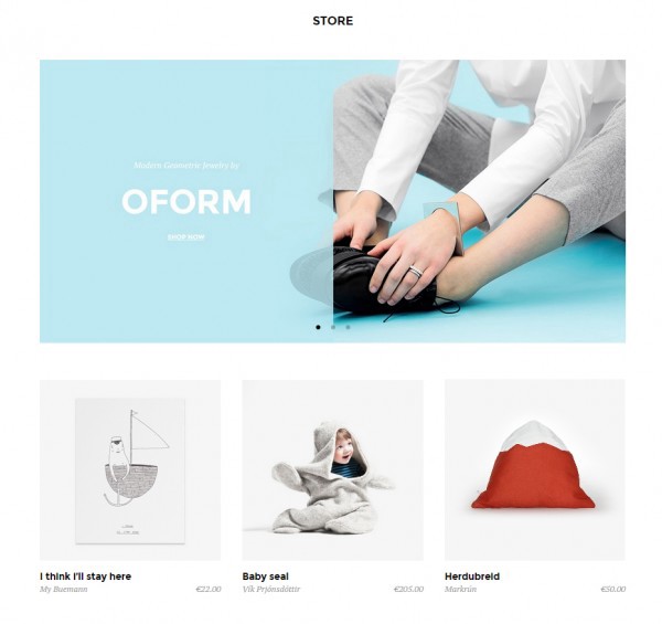
Show your products on the homepage so users can see examples.
Ensure products can be accessed directly from the homepage (single product page).
Don’t include rotating carousel images. Use a simple image, value proposition, and call to action after the value has been communicated.

- Organize your goods into a user-orientated hierarchy.
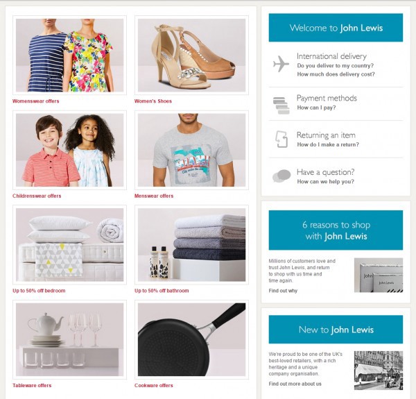
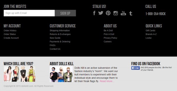
Build trust by linking to customer service phone numbers and addresses, offering live chat, or displaying your privacy policy.
Feel reliable. Offer links to your returns policy, shipping information, and delivery information.
- Keep the page simple and don’t clutter it with too many options that will overwhelm visitors.
E-commerce Category Pages
- Offer filtering of products and sorting features.

- Use product badges to highlight deals and sales.
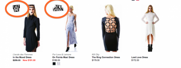
- Offer large product images with small grids (e.g. 3 x X images).
- Do not clutter the page with pop-ups or sidebars.
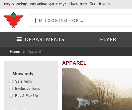
- Include breadcrumbs so that users can see how they navigated to that page and have a general understanding of where they are on the site.
eCommerce Single Product Pages
- Include very large high quality images of products in all available colors.

- Highlight shipping and delivery information.

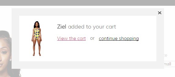
- Use animations that let users know they’ve successfully added a product to the cart.
eCommerce Shopping Cart Pages
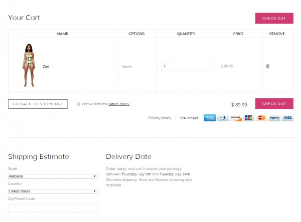
- Allow visitors to edit the amount of each cart item.
- Include images in the cart so users do not have to struggle to remember what each item looked like.
- Show the types of payments you accept.
- Show the total price with the option to change shipping.
- Have a clear call to action to check out above and below the cart.
- Hide coupon fields and replace them with a “Coupon?” link.
- Remind users about shipping details, delivery information, and return policies.
Getting More Sales Requires Research Not Random Testing
Everyone wants more users to complete purchase on their website. The way to get there is not through A/B testing random ideas, but rather, by following a proven process for e-commerce conversion optimization that entails research and user data.
So if you are serious about improving your conversion rates, I’ve put together a free bonus area download, which includes:
PDF — A checklick of 247 usability guidelines to help you increase profits for your online shop or website
PDF — 25 Conversion rate best practices that will help give you ideas for testing and website changes
Access the free bonus area here
About the Author: *The post above was written by Giles Thomas, founder of AcquireConvert and head mentor for marketing at the Google Accelerator Launchpad. [AcquireConvert](http://acquireconvert.com/) is the place where marketers and businesses go to learn about conversion optimization.*


